Design by Dan E
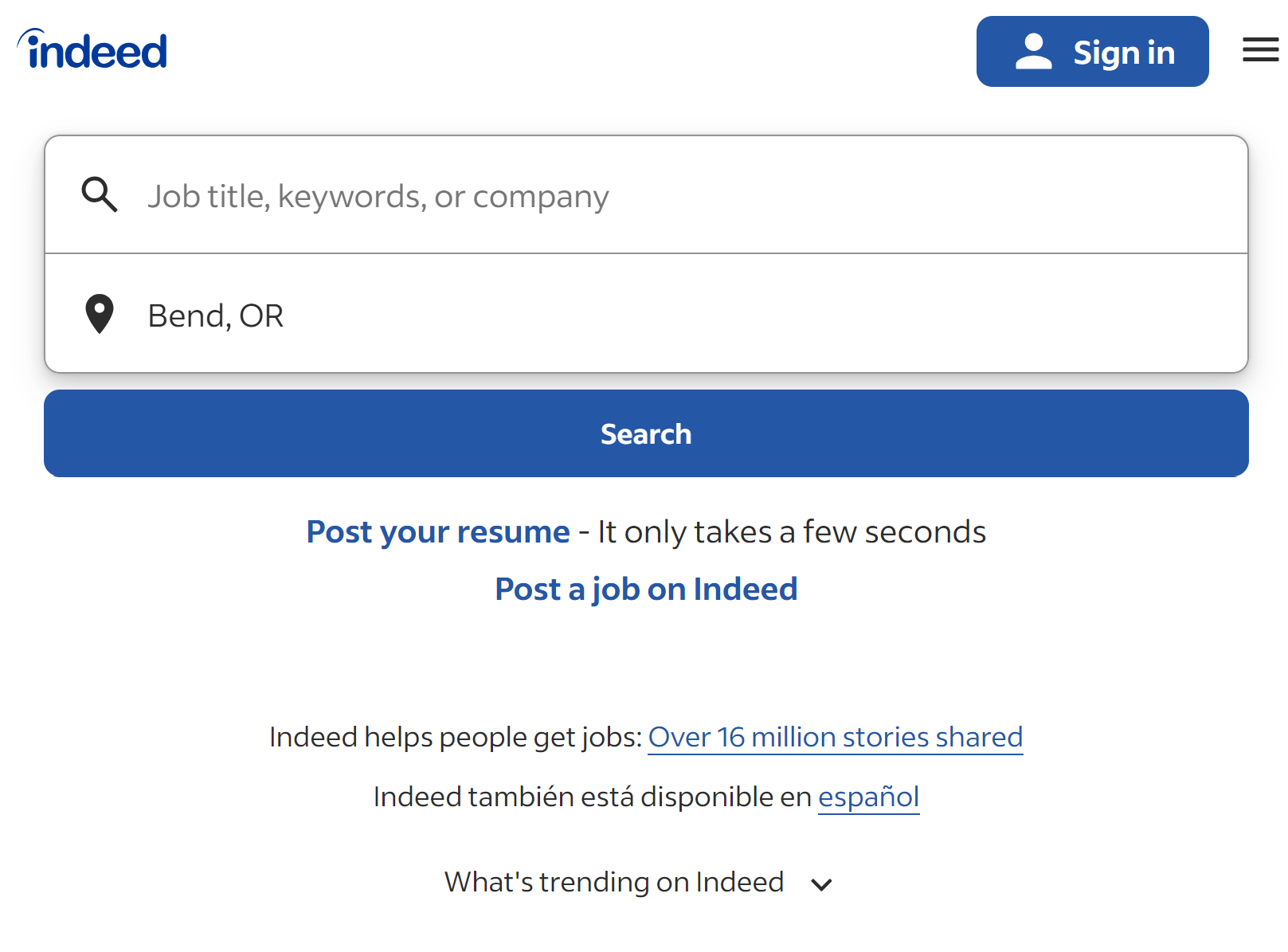
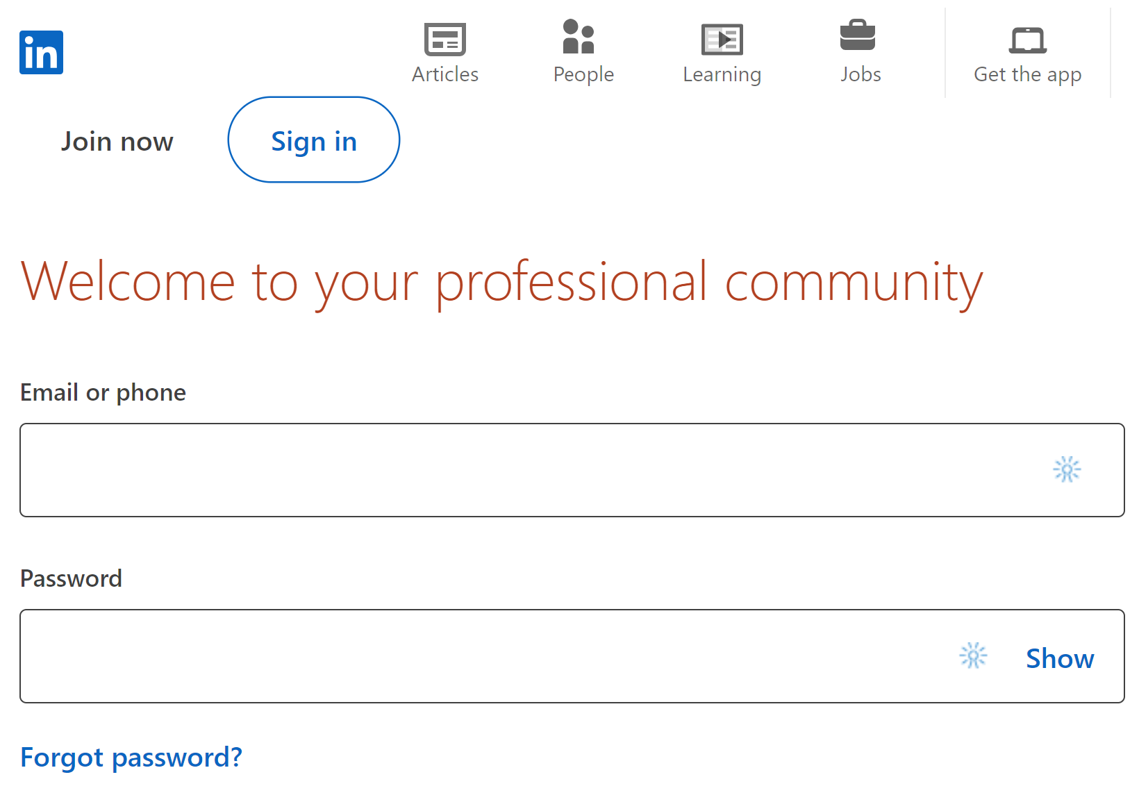
Repetition: Both LinkedIn and Indeed use consistent color schemes throughout their platforms. LinkedIn employs its signature blue across various elements to enhance brand recognition, whereas Indeed uses a deep blue that appears in buttons and links, promoting a cohesive user experience.
Contrast: LinkedIn uses a high contrast between the text and background, making information easy to read. Indeed also uses strong contrast, especially in its job listings, to help important information stand out.
Alignment: Both sites use grid layouts to organize content clearly and logically. This alignment helps users easily scan through information, whether they are browsing job listings on Indeed or networking opportunities on LinkedIn.
Proximity: On both platforms, related user elements are grouped together. For instance, LinkedIn groups user profile components like connections, recommendations, and skills closely together, which aids in quick comprehension.